No-Paint Color Schemes for Small Apartments
Most palette guides start with a paint tin. That is no help when the lease says the walls stay as they are. The good news is that a room’s colour does not live only on its walls: the rug, the bedding, the curtains, the sofa and the art carry far more colour than most renters realize. These no-paint color schemes for small apartments build a complete palette from movable things only, so the whole scheme can move out with you when the lease ends.
The method is simple, and it works in any rental. First, read the colours you cannot change. Then pick three colours — a base, a supporting neutral and one accent — and repeat them through the room’s movable pieces. The palettes below name their three colours and what carries them.
Start With What You Cannot Change
Before choosing anything, list the fixed colours in the room: the flooring, the countertops, the cabinets, the tile, the doors, the window frames and the large appliances. These surfaces cover more visual area than any accessory, so they are the real starting point of the palette. A warm oak floor and a cool gray countertop will pull a room in two different directions unless the movable pieces bridge them.
Stand in the doorway and note the undertone of each fixed surface. Is the wood warm and honey-toned, or pale and ashy? Is the tile creamy or stark white? Is the countertop speckled warm or cool? Write down two or three words for each surface. Those words are your constraint, and working with them is what makes a palette look intentional instead of accidental. Fighting a fixed finish with a clashing accent is the fastest way to make a small room feel busy.
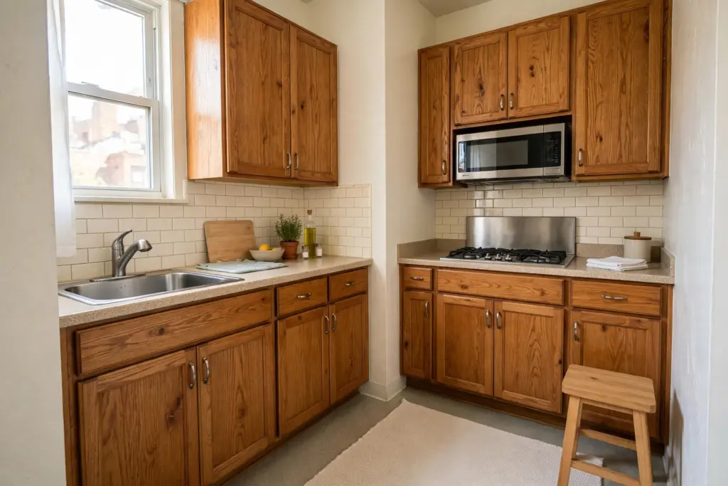
The practical rule: at least one movable colour should echo each dominant fixed finish. Warm oak pairs naturally with oatmeal, sand and light wood tones; a cool gray floor pairs better with pale greige, soft white and muted metals. You do not need to match anything exactly — echoing the undertone family is enough.
The Three-Colour Rule, No-Paint Version
Every palette in this guide uses three colours, and no more. One dominant base covers the most area and is carried by the largest movable piece, usually the rug or the bedding. One supporting neutral bridges the fixed finishes and the base, carried by curtains, upholstery or storage pieces. One accent appears two or three times — in art, cushions, a lamp or a plant pot — so it reads as a deliberate choice rather than a stray purchase.
The repeat is what makes the accent work. A single terracotta cushion in an otherwise neutral room looks like a leftover. The same terracotta in a cushion, a framed print and a ceramic vase looks like a scheme. Two or three repeats are enough; five or six turn an accent into a second base colour and the room starts to feel loud. This discipline matters most in a small room, where every colour is visible from every seat.
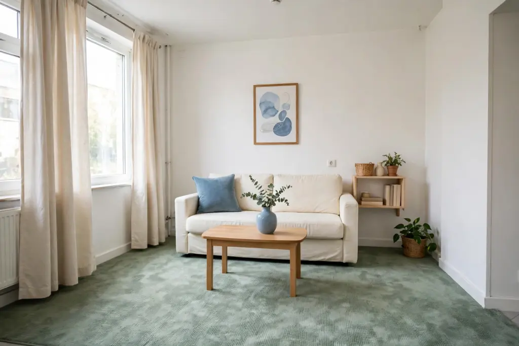
When you shop, carry the three colours with you: a phone photo of the rug and a swatch in the accent colour. Hold every candidate purchase against them before buying — if it matches none of the three, it stays in the store.
Six Palettes You Can Build Without Paint
Each palette below names its base, its neutral and its accent, plus the movable pieces that carry them. Pick the one whose fixed finishes match your room, then build it piece by piece, largest carrier first. All six work with plain white, cream or beige rental walls, because none of them asks the wall to do any work.
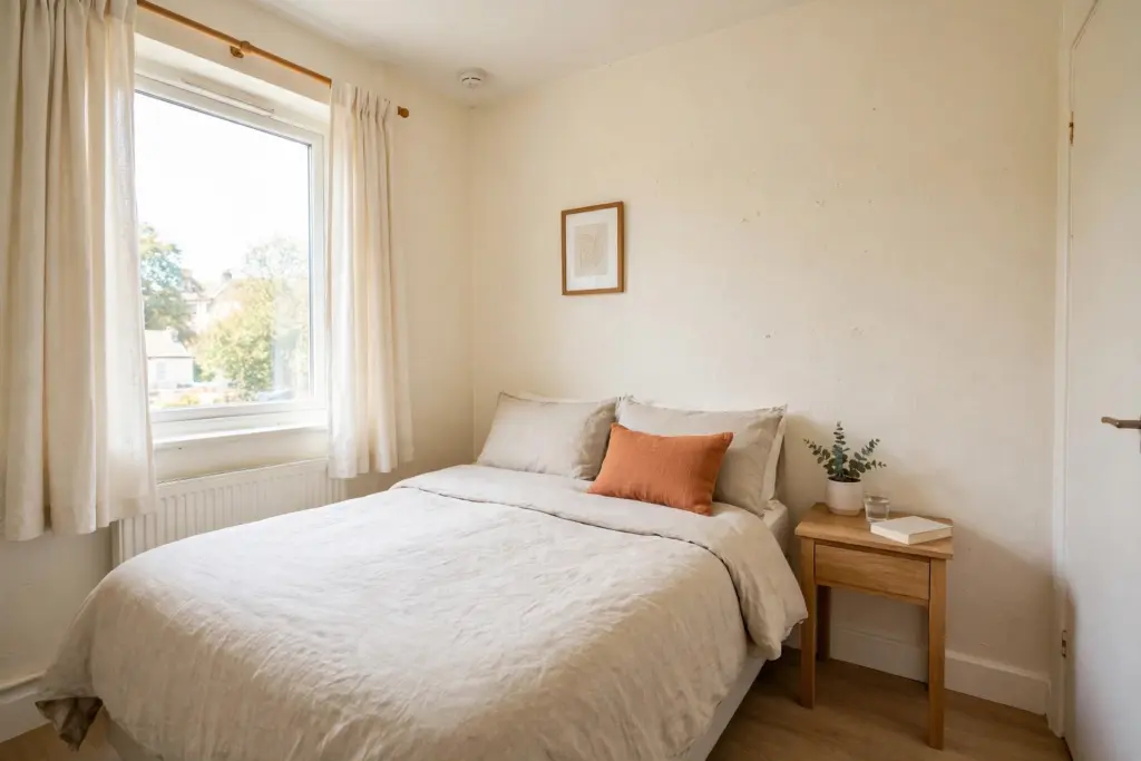
1. Warm Ivory, Oatmeal and Light Oak
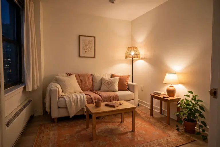
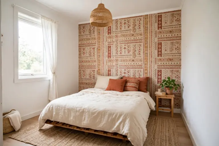
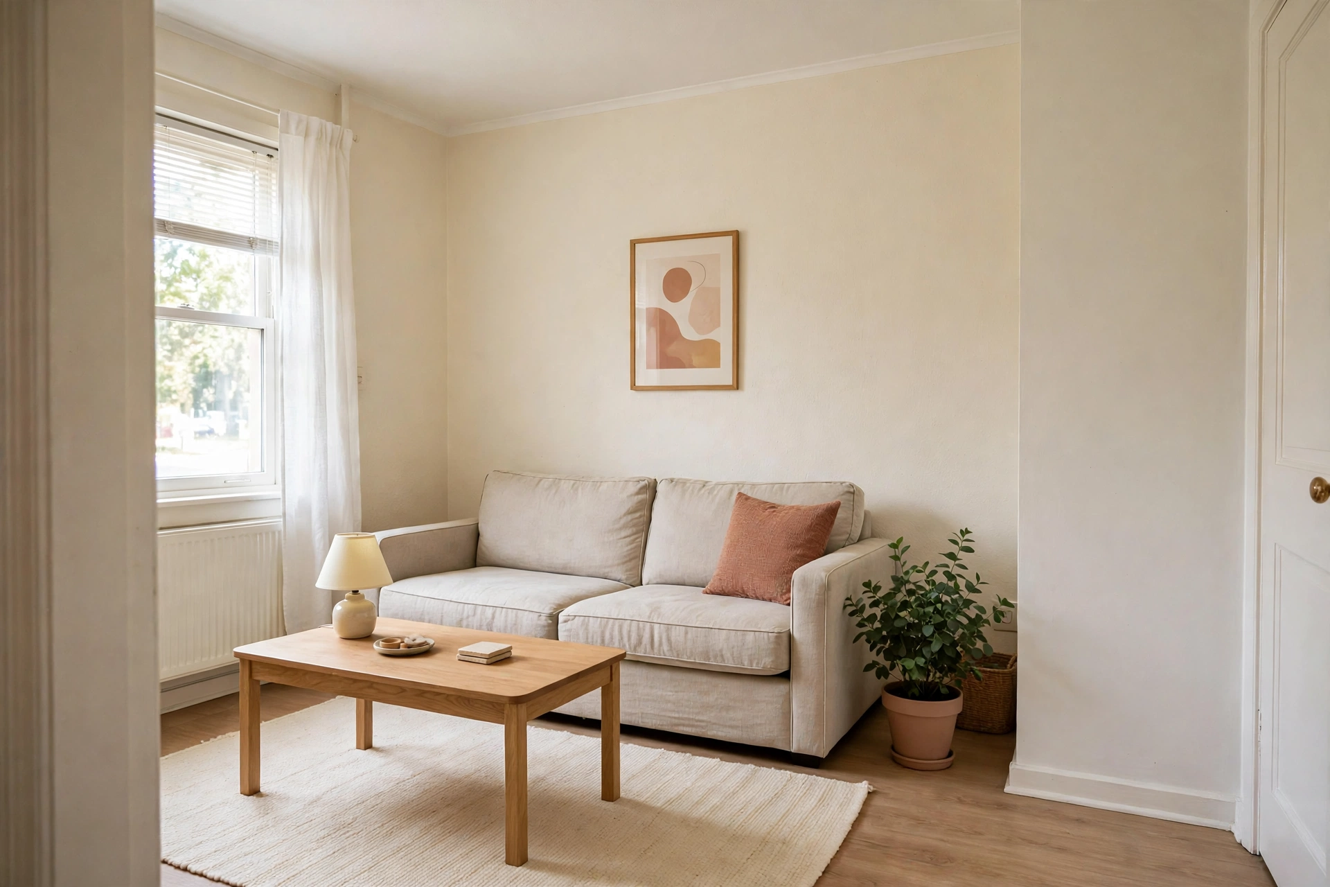
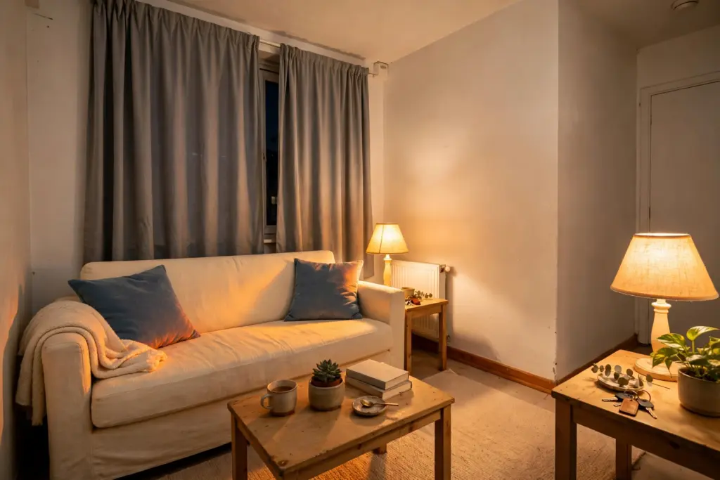
Base: warm ivory, carried by the rug and the bedding. Neutral: oatmeal linen, carried by the sofa or duvet cover. Accent: soft terracotta, repeated in one cushion, one framed print and one plant pot. This is the safest palette in the guide and the best match for warm oak floors and honey-toned wood. It suits bedrooms especially well, and in a dim room it keeps things warm without adding visual weight.
2. Pale Greige, Flax and Warm White
Base: pale greige, carried by the rug or a large throw. Neutral: flax, carried by curtains and upholstery. Accent: warm white, which sounds like no accent at all — that is the point. Here the contrast comes from texture rather than hue: a chunky knit throw, a woven basket and a matte ceramic vase in warm white against the greige base. This palette suits rooms with cool gray floors or stainless appliances, and it is the most forgiving choice if your fixed finishes are a mixed bag.
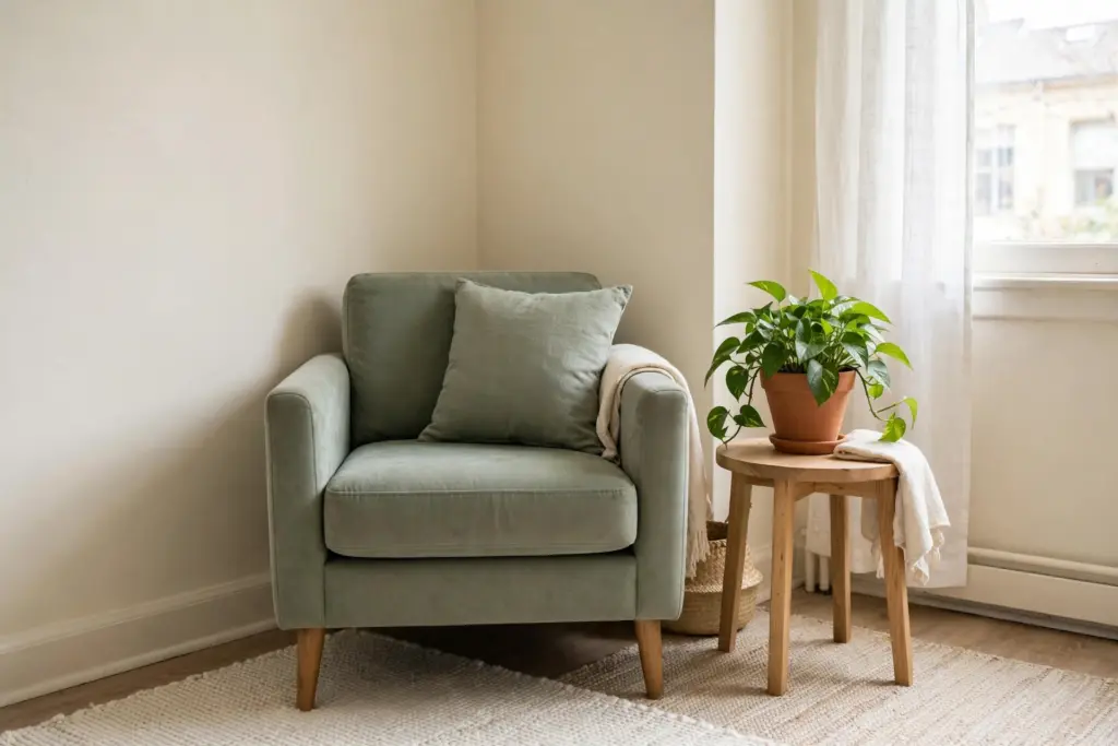
3. Faded Sage, Cream and Natural Wood
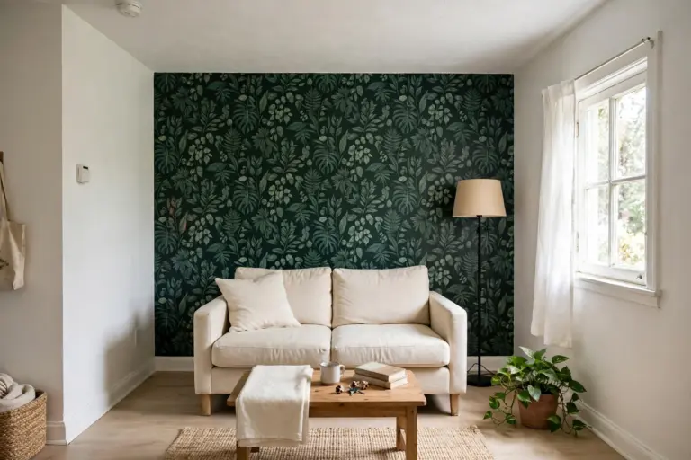
Base: faded sage, carried by an armchair or a large cushion set. Neutral: cream, carried by curtains and the rug. Accent: natural wood, repeated in a side table, a picture frame and a plant pot or basket. Green reads as a colour here, but faded sage is muted enough to behave like a neutral, which makes this palette easy to live with. It works beautifully with cream tile and light wood floors, and green plants extend the palette for free. For more renter-friendly decorating ideas that use the same no-damage approach, see renter-friendly apartment decorating ideas.
4. Dusty Blue-Grey, Soft White and Muted Metal
Base: dusty blue-grey, carried by the rug or bedding. Neutral: soft white, carried by curtains and upholstery. Accent: muted metal, repeated in a lamp base, a picture frame and a small tray or vase in brushed brass or pewter. This is the coolest palette here, and the best choice for a room with gray or white fixed finishes and plenty of daylight. Keep the metal muted: shiny chrome or bright gold would turn the accent into the loudest thing in the room.
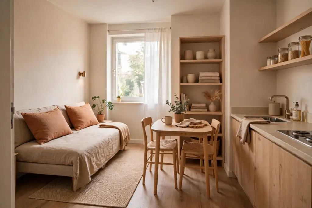
5. Soft Clay, Sand and Warm Neutral
Base: soft clay, carried by cushions and a throw on a neutral sofa. Neutral: sand, carried by the rug and curtains. Accent: warm neutral wood, repeated in shelving, a dining table and a serving board or tray. This palette carries a whole studio well, because the same three colours run through the sleeping, living and eating zones and stop the room from looking chopped up. If your studio has one open plan, this is the palette to try first.
6. Buttercream, Pale Wood and Gentle Contrast
Base: buttercream, carried by bedding or a large rug. Neutral: pale wood, carried by furniture and shelving. Accent: gentle contrast in a muted olive or dusty rose, repeated in one cushion, one art print and one small ceramic piece. This palette is built for dim rooms: buttercream reflects what light there is, and the accent is soft enough not to darken it. Apartment palette guides often pair buttercream with pale wood for exactly this reason, as seen in the apartment color palette ideas from Panyl.
Light Changes the Colour
The same textile reads differently at 9 a.m. and at 9 p.m., and differently again under warm and cool bulbs. A greige rug can look warm gray in morning daylight and almost taupe under a warm lamp. That is why you should compare candidates in the actual room before committing, in both daylight and lamplight.
Bulb temperature is the one lighting decision that belongs in a colour guide. Warm-white bulbs (around 2700K) make warm palettes glow and cool palettes look muddy; cool-white bulbs (around 4000K and up) sharpen cool palettes and can make warm ones look washed out. Match the bulb to the palette family: warm palettes get warm-white bulbs, cool palettes get neutral-to-cool bulbs. For the full lighting picture beyond bulb temperature, see renter-friendly lighting ideas.
When the Walls Fight Back
Some rentals come with a strong existing wall colour — a deep beige, a warm yellow, a dusty green — and no permission to change it. The instinct is to add more colour to compete with it. Do the opposite. Treat the existing wall colour as the room’s base, quieten everything else, and let one strong colour plus quiet movables carry the room.
In practice: pick movables in the same undertone family as the wall, keep the accent to a single muted tone, and skip bold pattern. If the wall colour is genuinely hard to live with, check the lease before doing anything to it, and remember that large art can cover more wall than any accessory.
Swap, Don’t Repaint
The renter advantage of a no-paint palette is that it moves. A palette built from a rug, a duvet cover, curtains and art packs into boxes and rebuilds itself in the next apartment in an afternoon. Seasonal change works the same way: swapping the accent refreshes the whole room for the price of a cushion cover and a print.
Start with the largest carrier, not the prettiest accessory: rug or bedding first, then curtains, then accent pieces. That order stops the classic mistake of a drawer full of accent cushions that match nothing. And if a palette stops working in a new room, only the accent layer needs rethinking.
One boundary: colour is not a size trick, and a pale palette will not make a small room physically bigger. For visual-size techniques like mirror placement and furniture scale, see how to make a small apartment look bigger. And for the warmth layer that sits on top of a palette — throws, texture and layered textiles — see cozy small apartment ideas. Colour sets the scheme; those guides handle the rest.
Frequently Asked Questions
Can color schemes for small apartments work without painting the walls?
Yes. Walls are only one carrier of colour, and in a rental they are usually the least flexible one. A rug, bedding, curtains, upholstery and art carry enough colour to define a whole palette, and because those pieces are movable, the scheme moves with you.
How many colours should a small room have?
Three is the practical limit: one base, one supporting neutral and one accent repeated two or three times. More than three colours in a small room usually reads as clutter, because every colour is visible from every seat.
What if my rental walls are a strong colour I did not choose?
Treat that wall colour as the base and quieten everything else. Choose movables in the same undertone family, keep the accent muted and singular, and skip bold pattern. Adding more colour to compete with a strong wall makes the room busier, not better.
Do I need to repaint if my landlord allows it?
No, and for most renters there is no reason to. A no-paint palette reaches the same finished-room look with movable pieces, and it avoids repainting costs and move-out repainting. Paint guides such as Benjamin Moore’s apartment colour ideas are still useful for colour families — just apply those families through textiles and furniture instead of a paint tin.